1. The Process of Designing and What Made Me Choose What I Chose
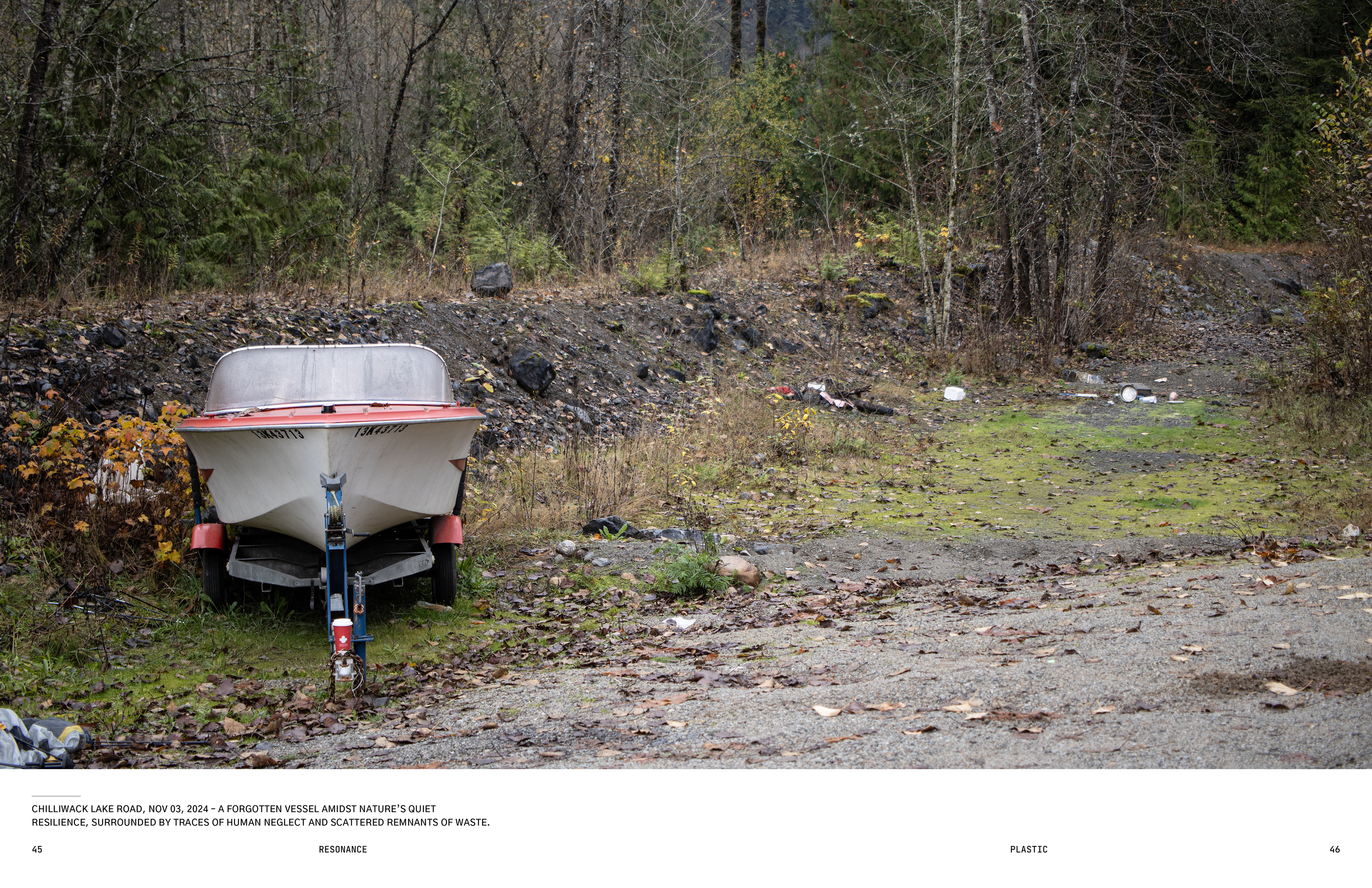
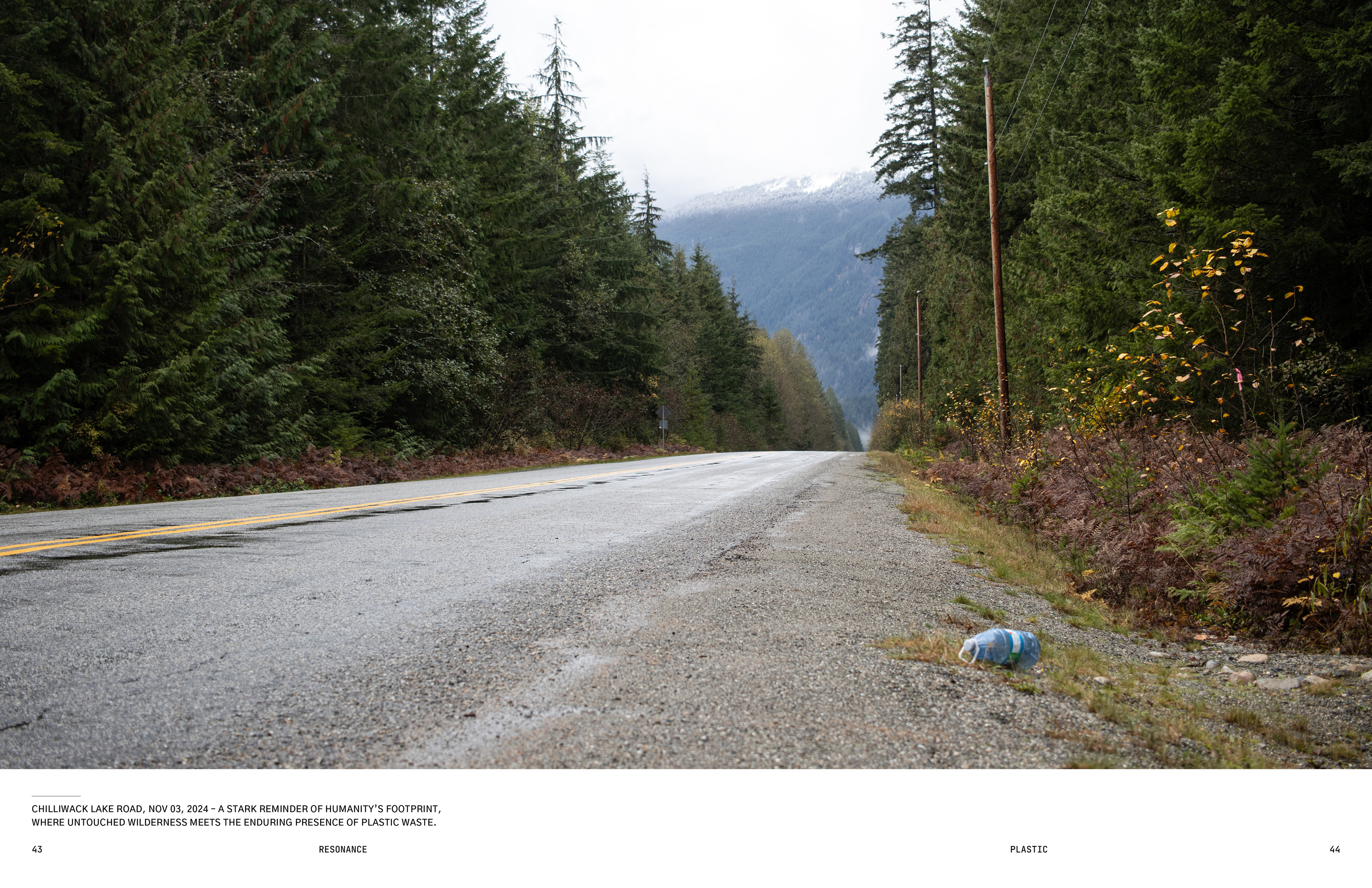
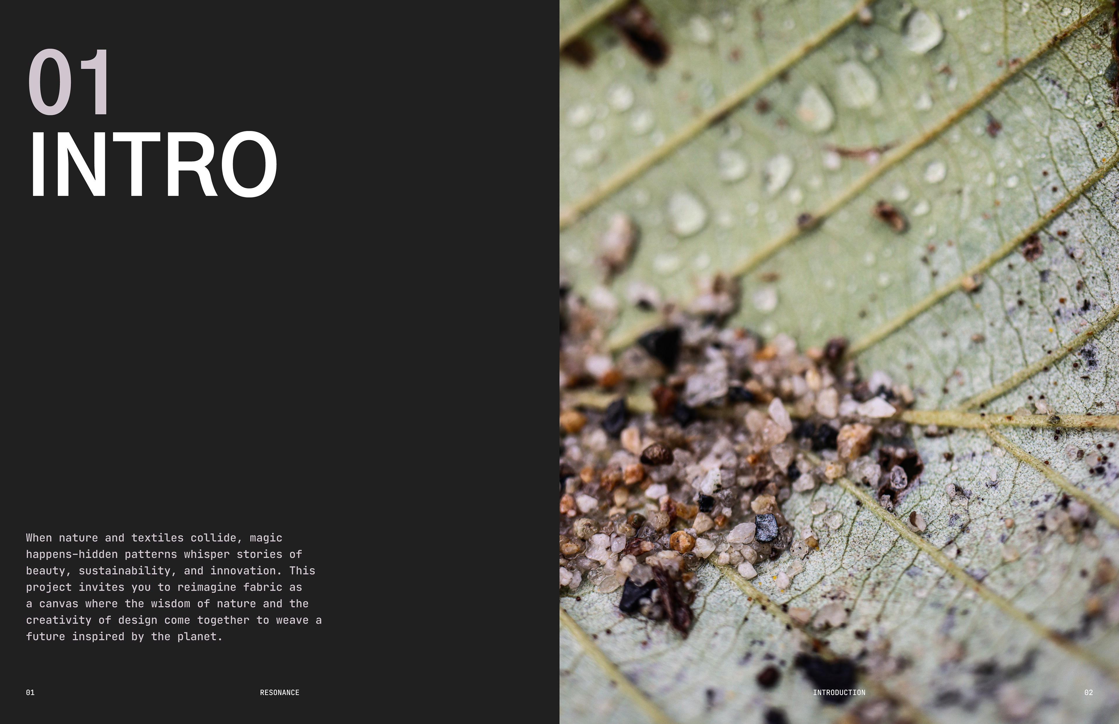
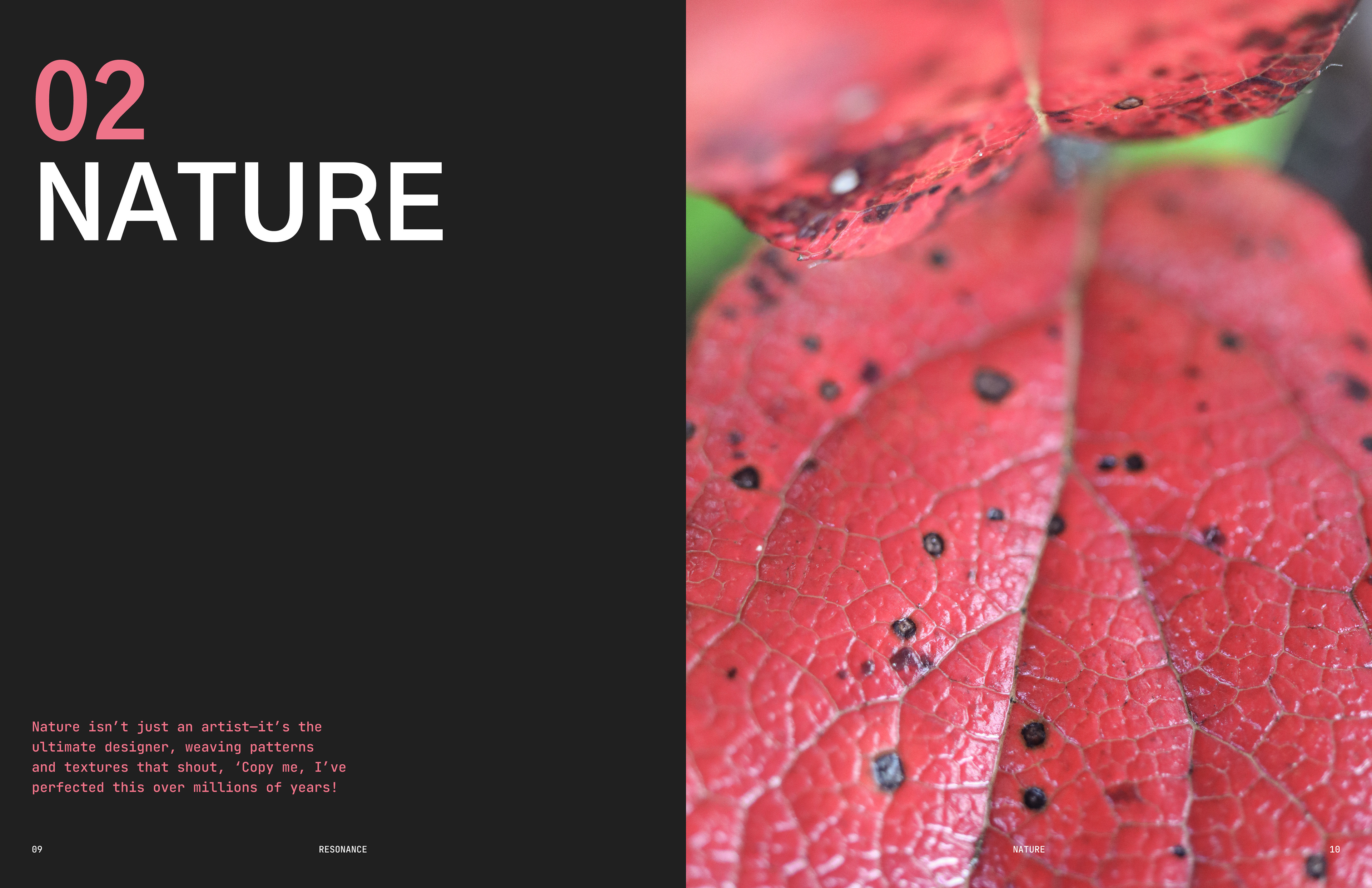
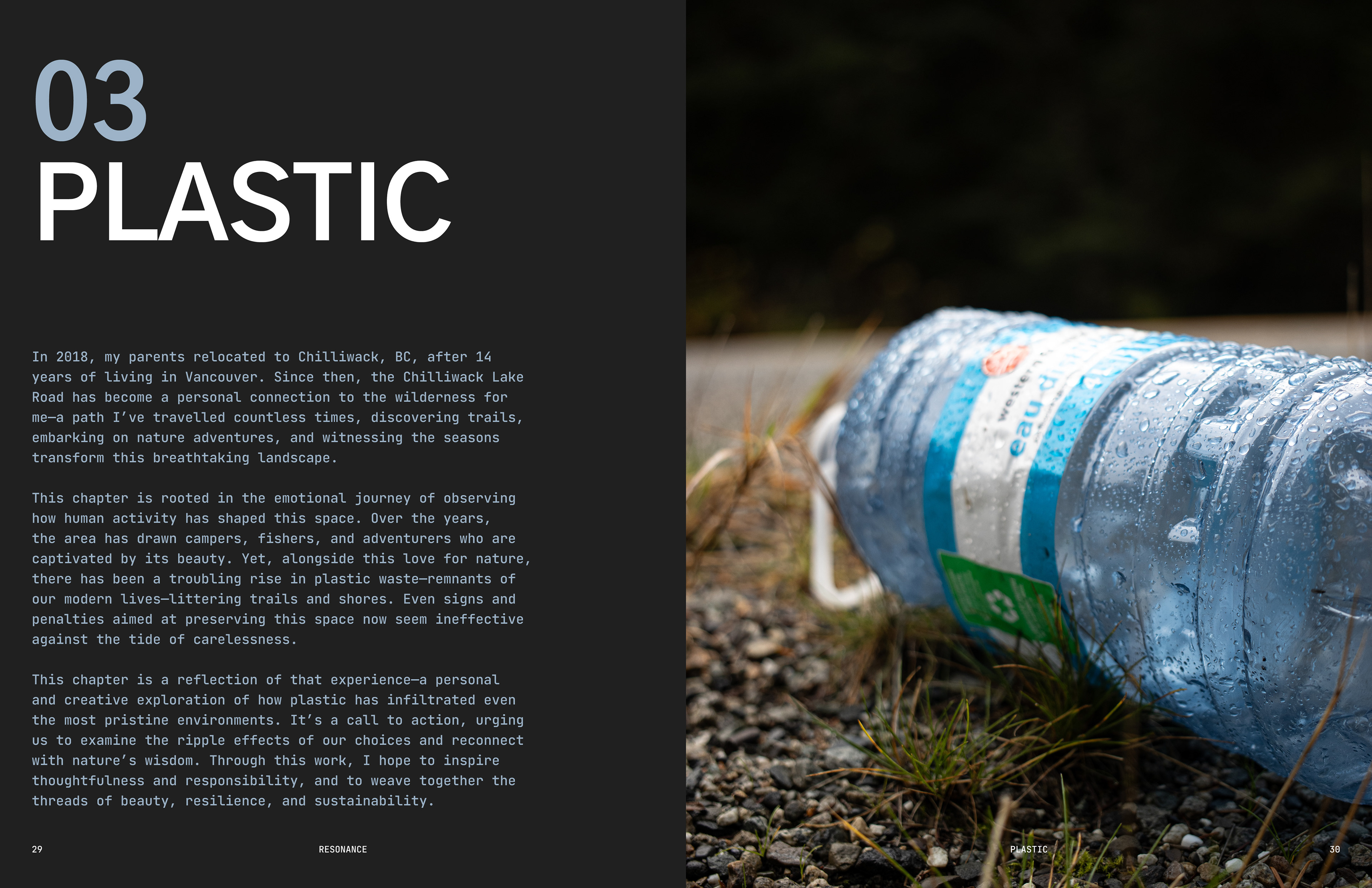
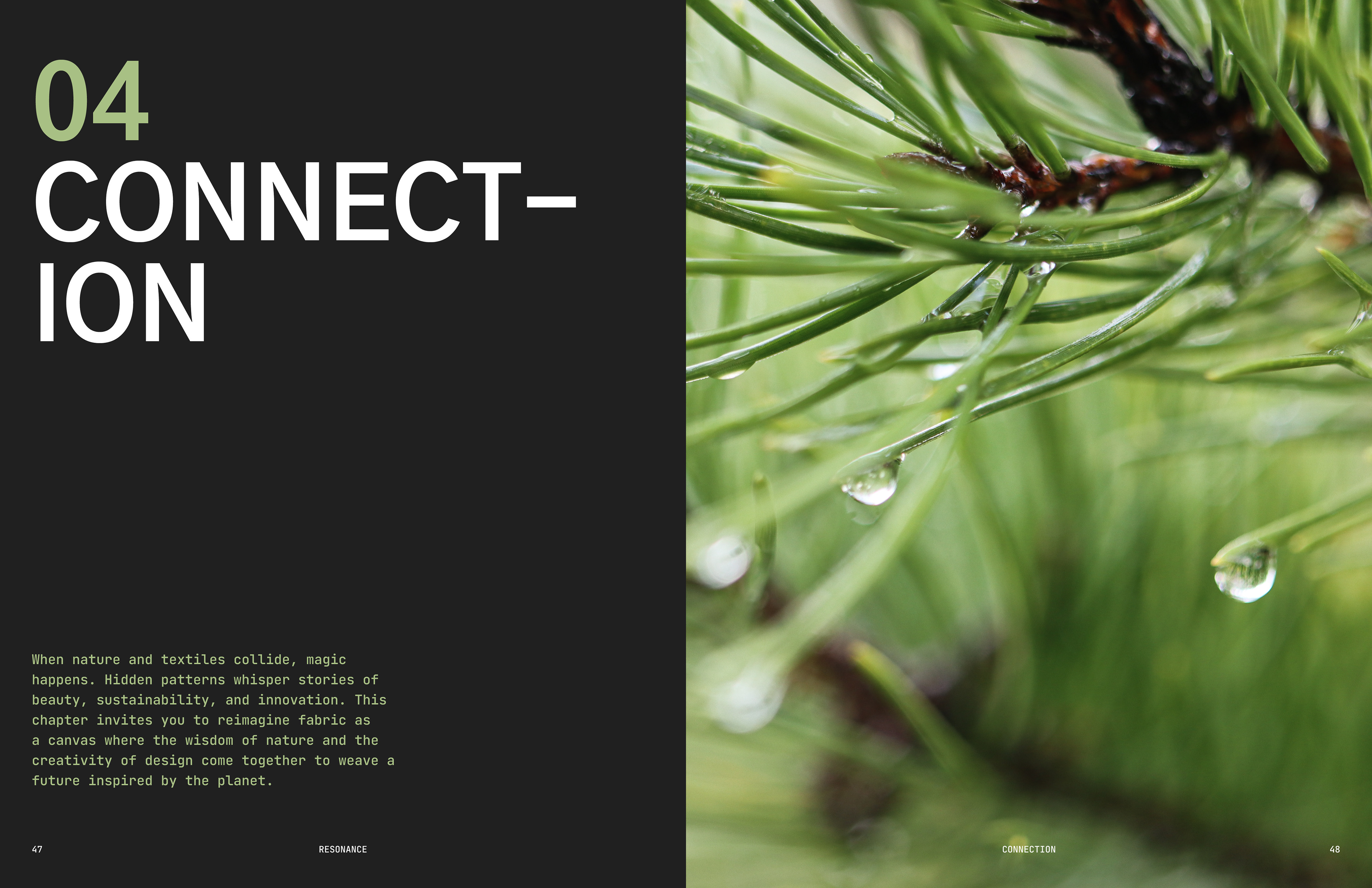
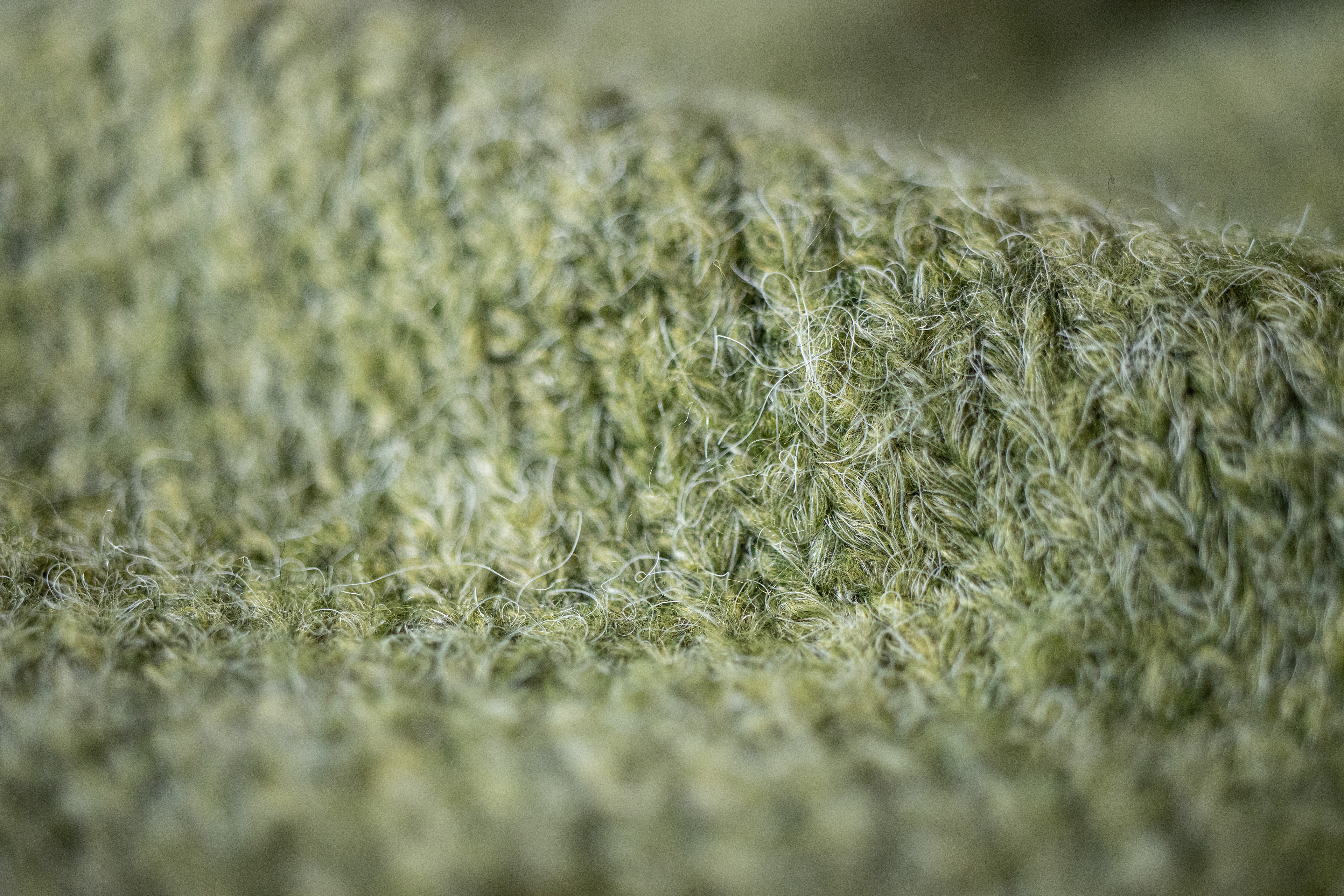
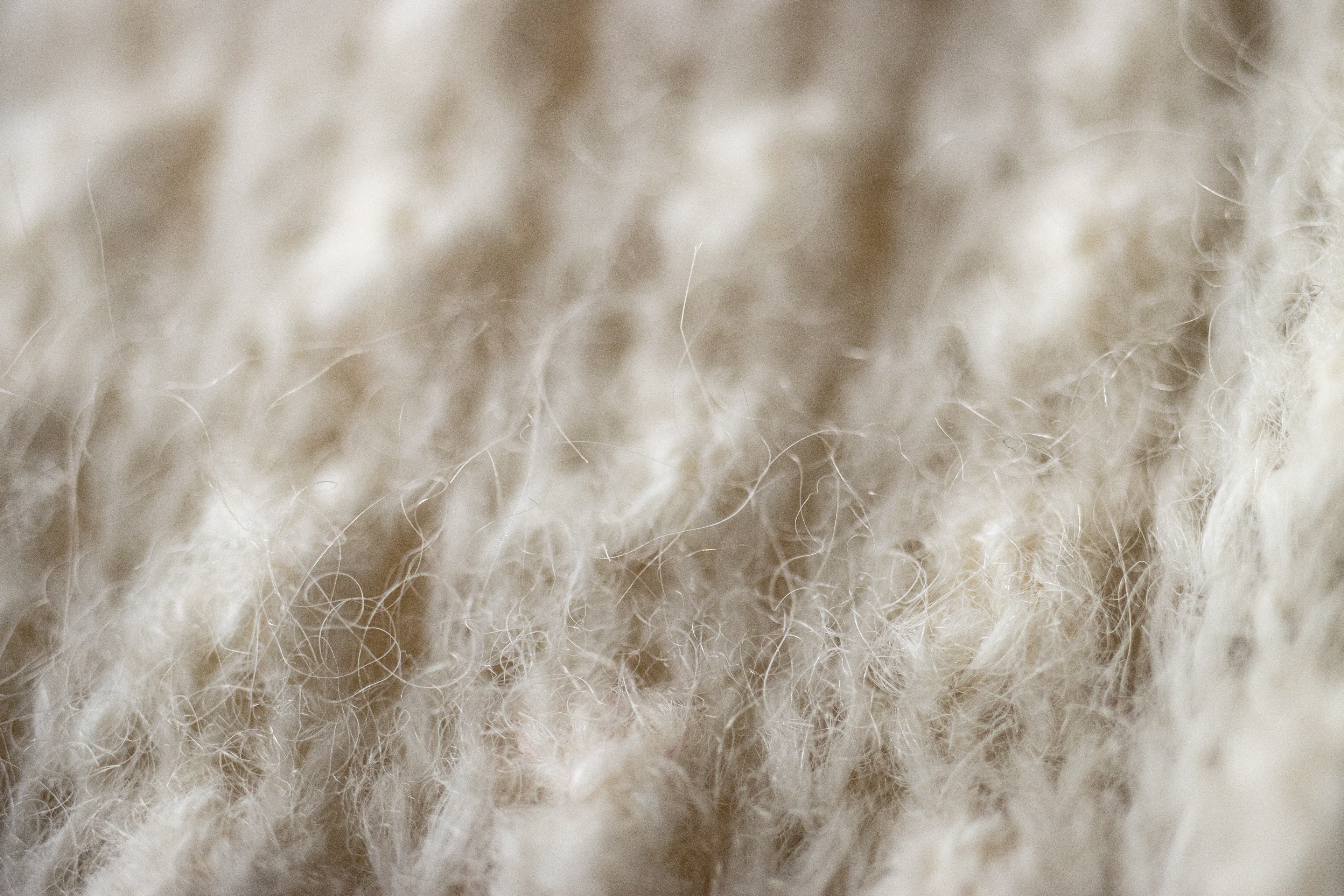
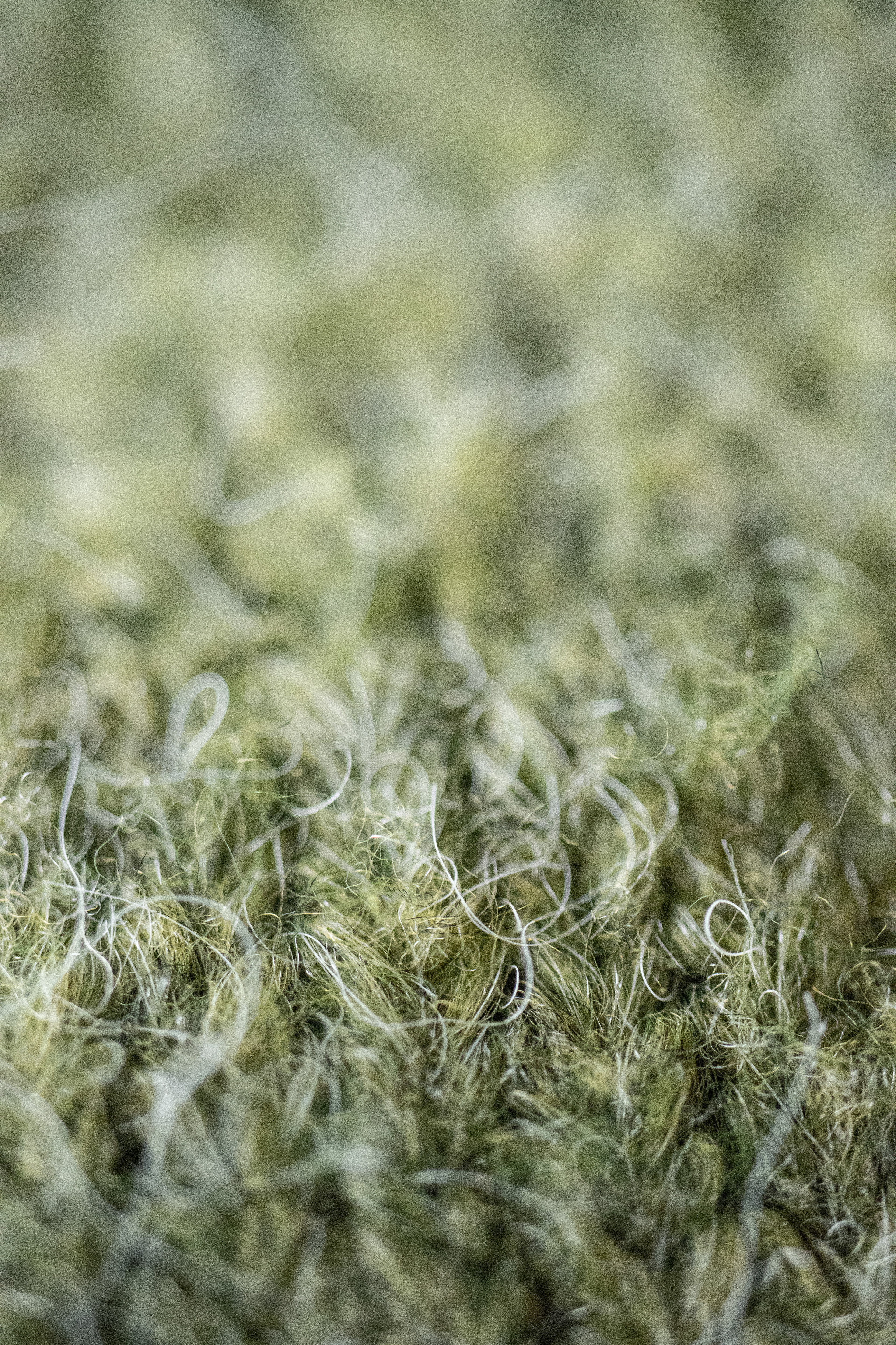
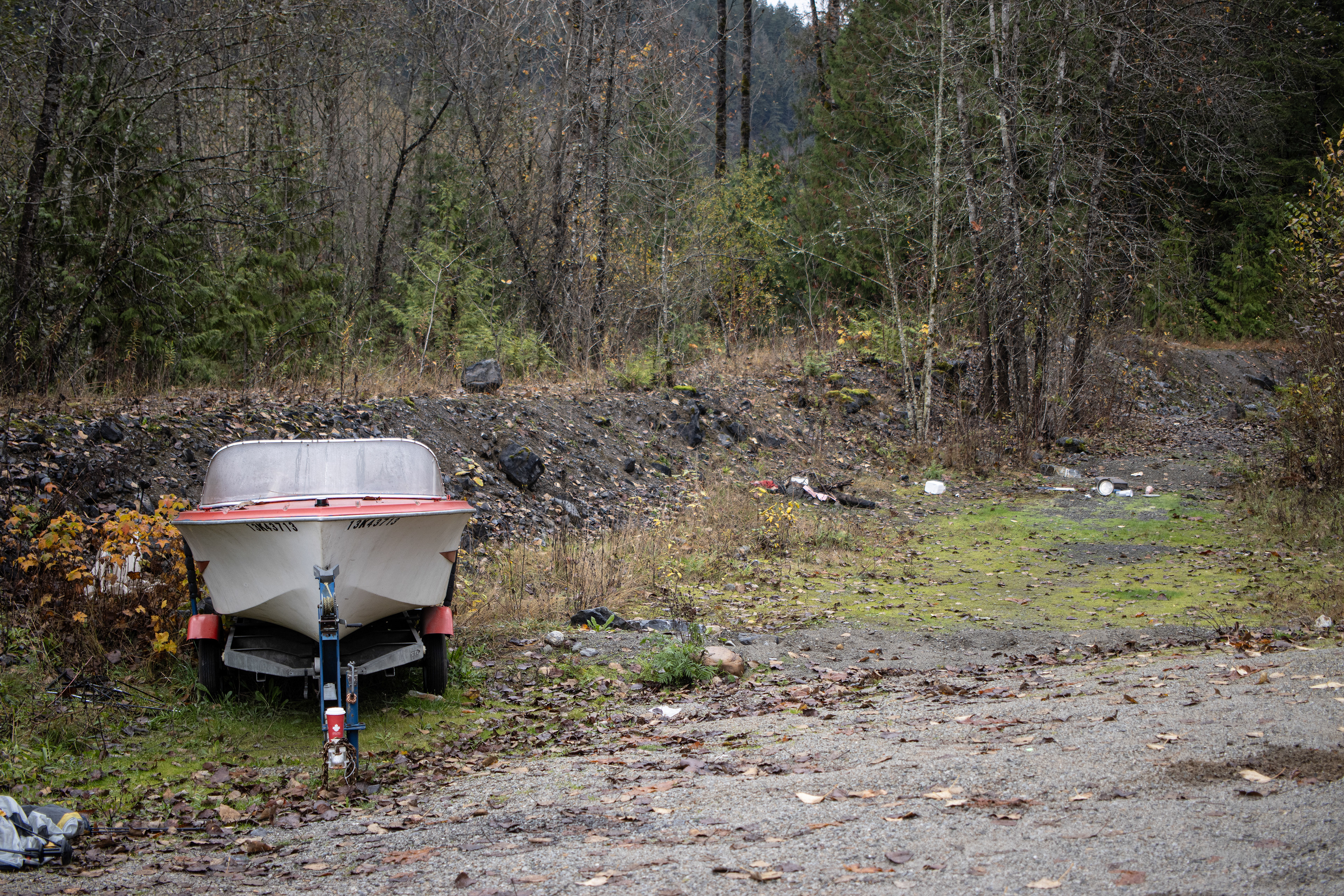
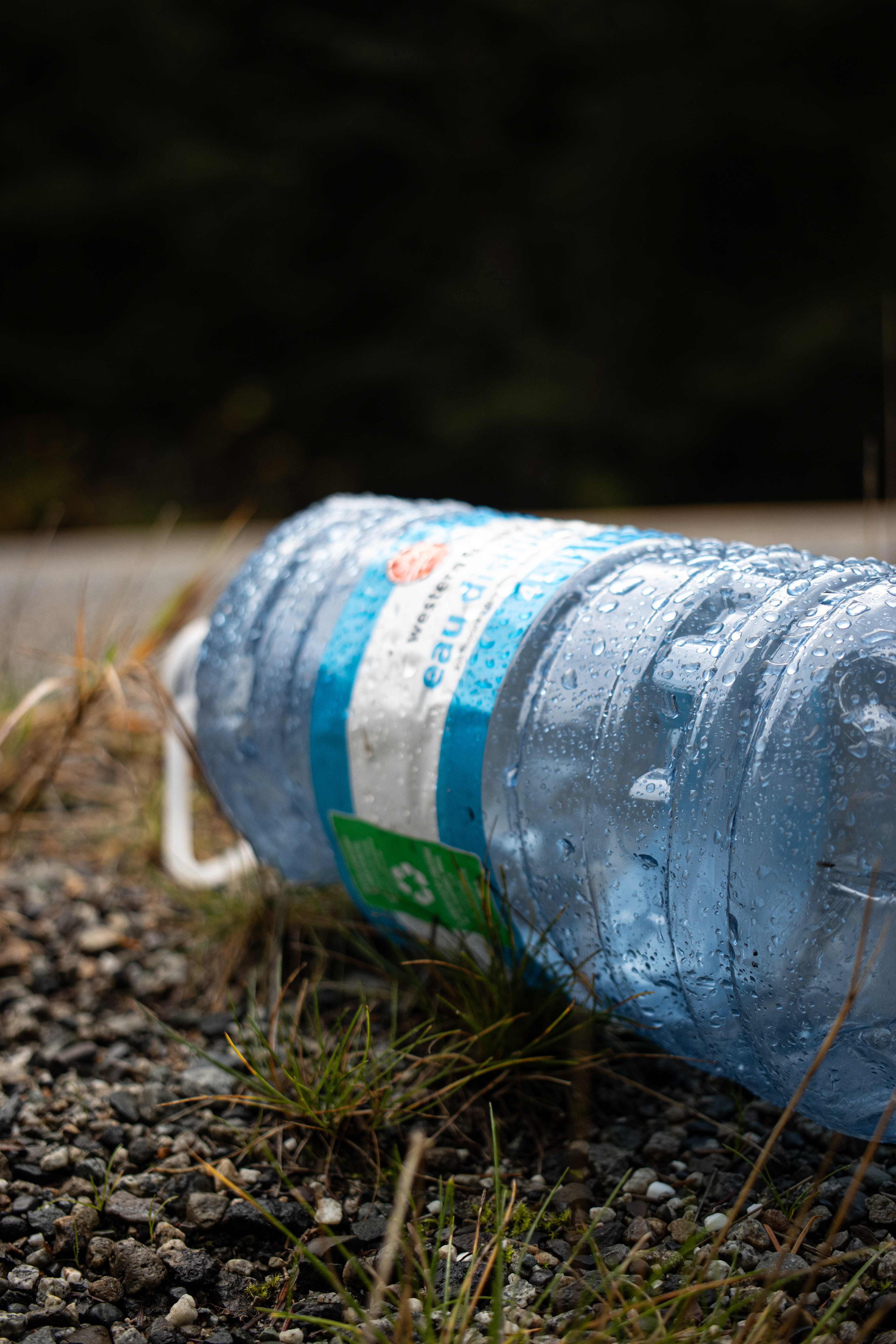
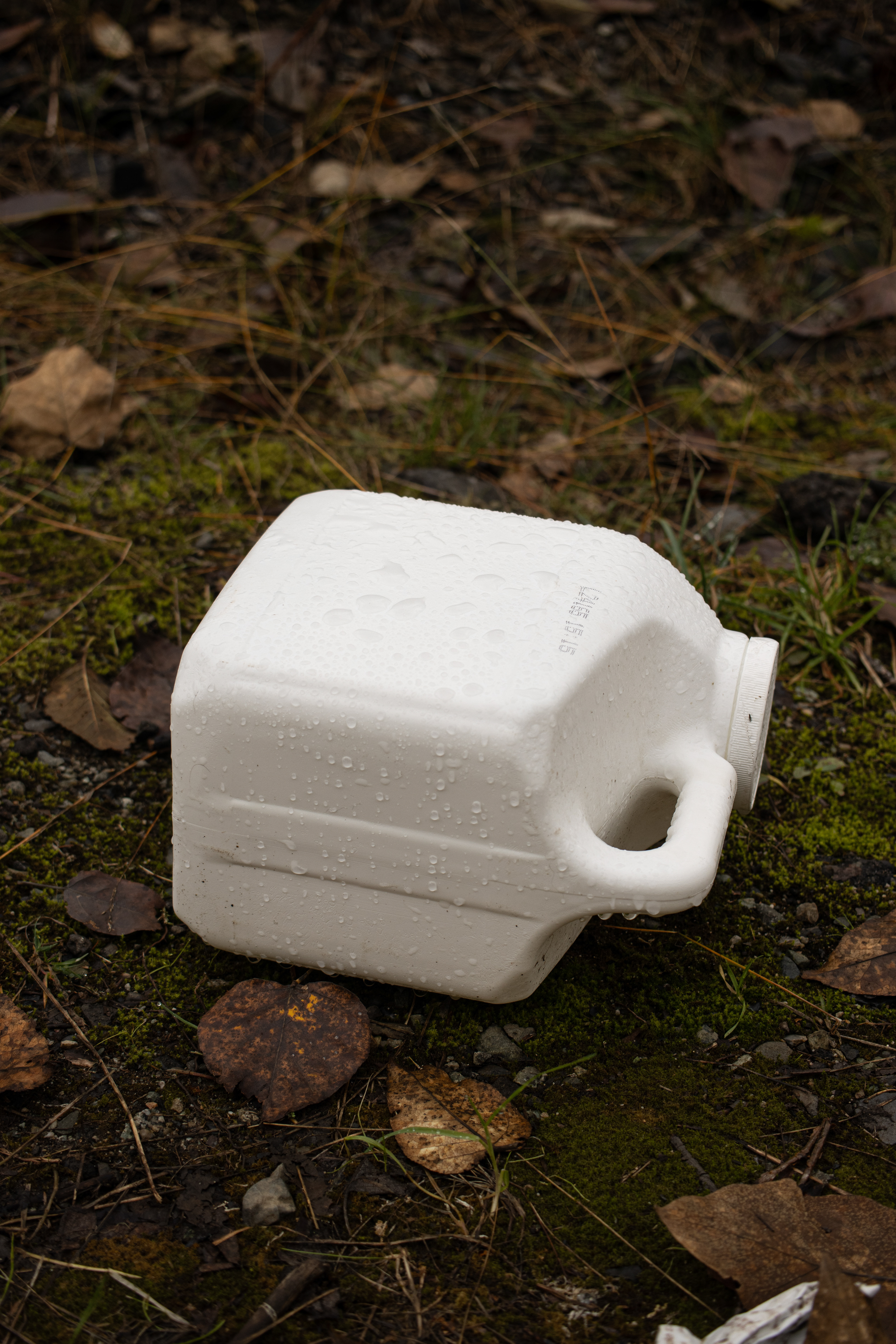
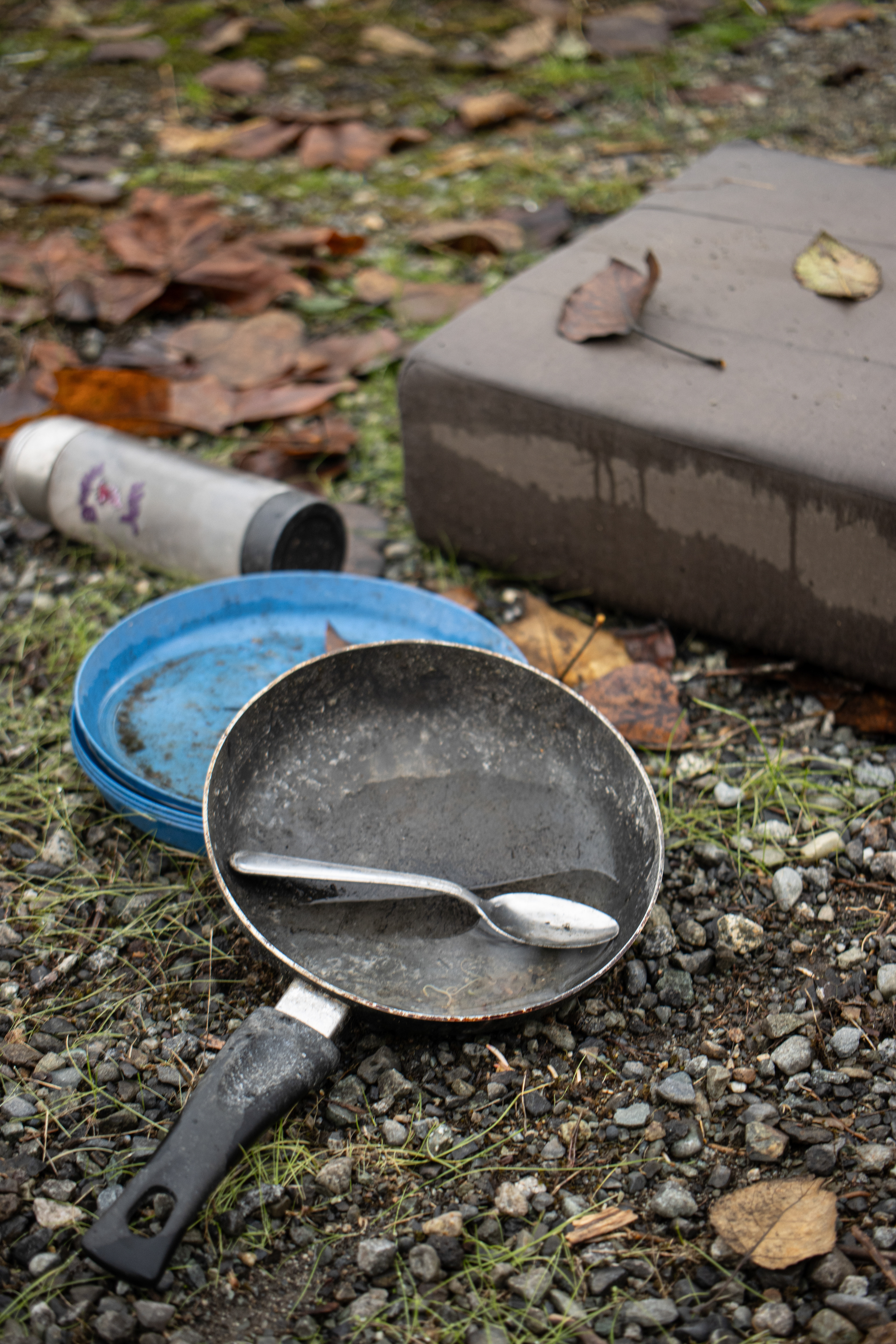
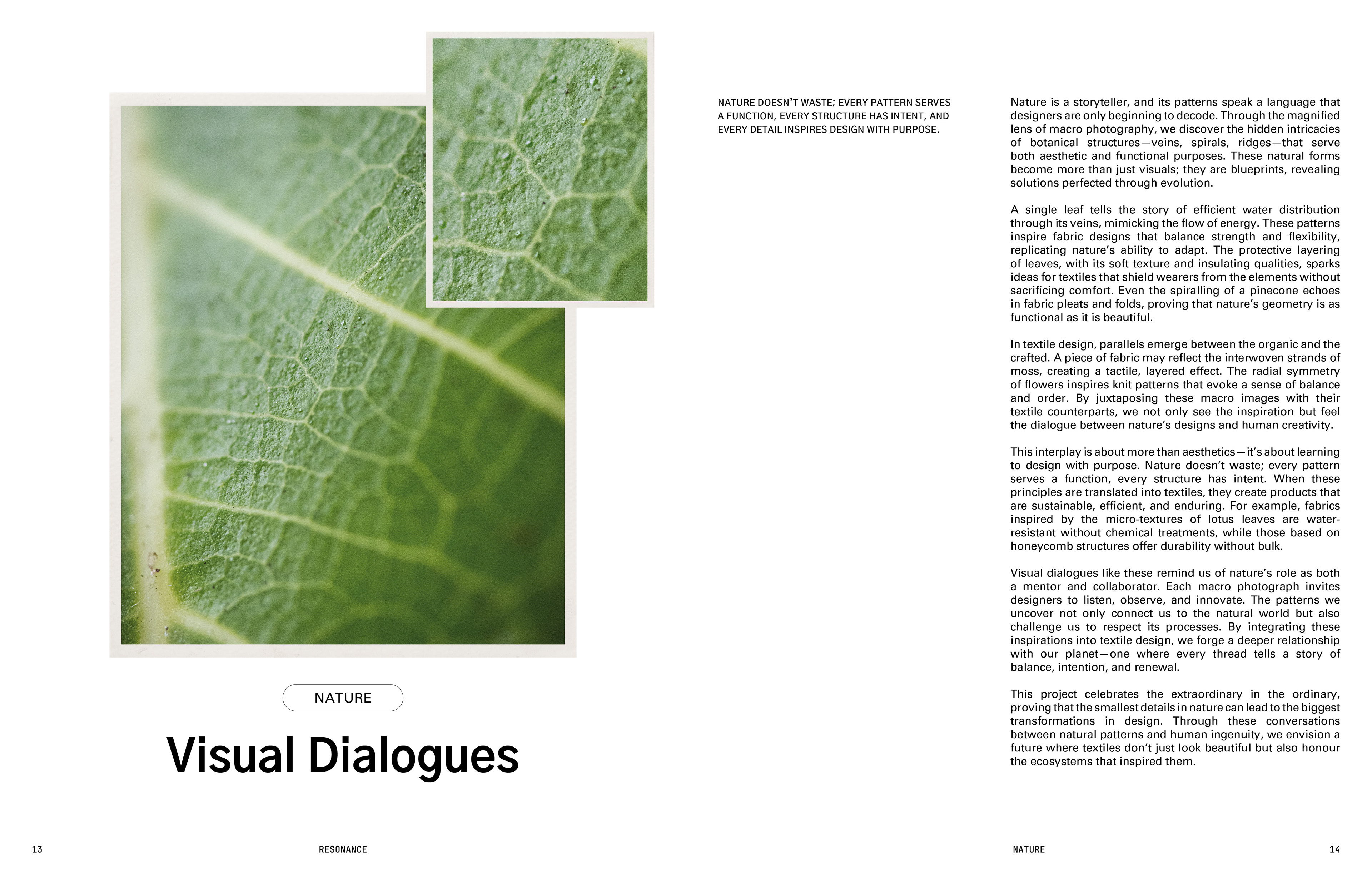
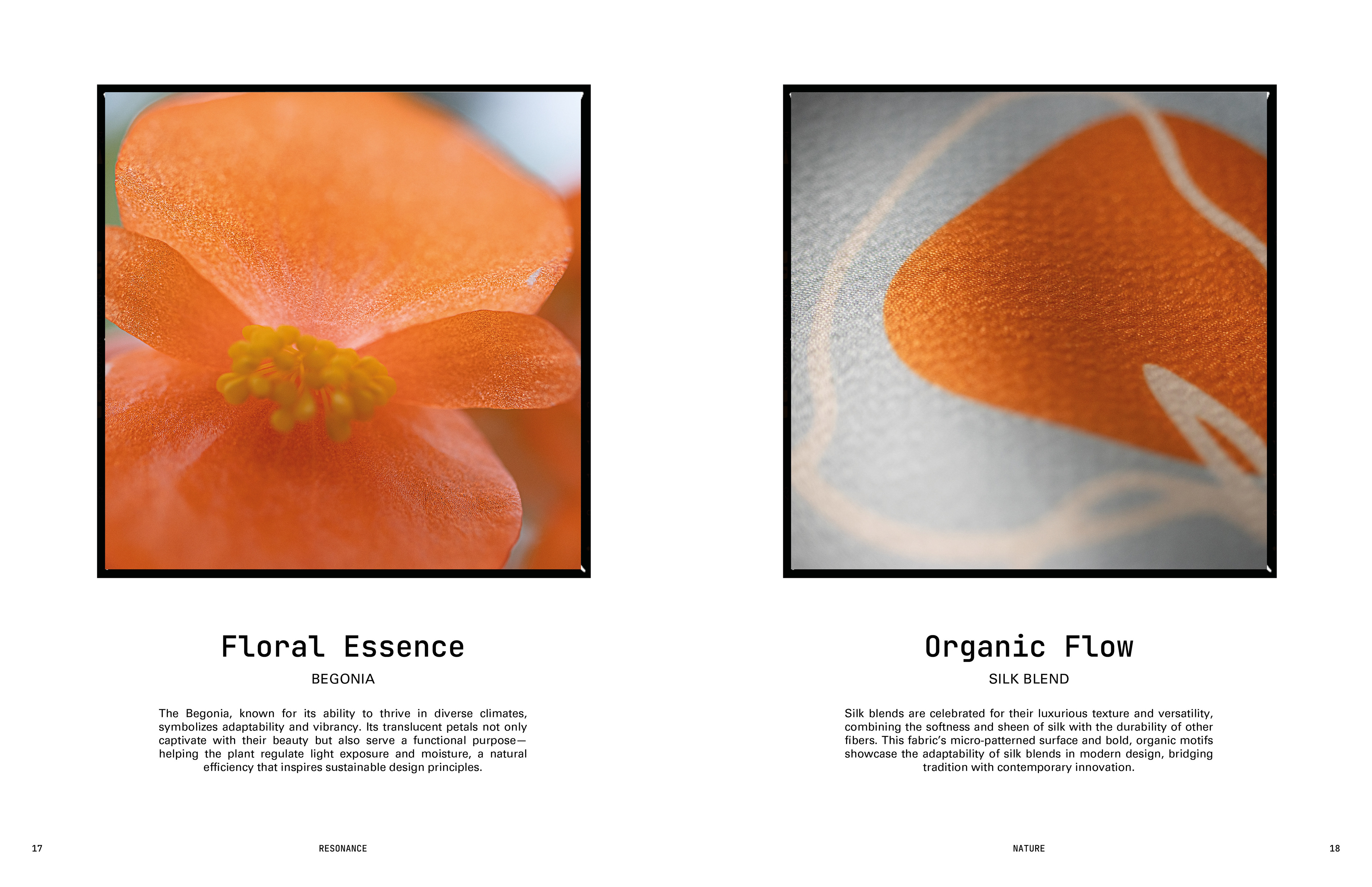
Prompt 4 was inspired by the tension between natural and synthetic materials. The project aimed to capture and highlight this contrast through macro photography, presenting the intricate beauty of organic textures alongside the rigid uniformity of synthetic ones. Observations during visits to natural settings like Chilliwack Lake provided a rich visual foundation for the project. The editorial format was chosen to create a narrative-driven, reflective experience for viewers, encouraging contemplation of the materials’ broader environmental implications.
Project: here
Editorial Design: here


2. Material/Aesthetic Concerns
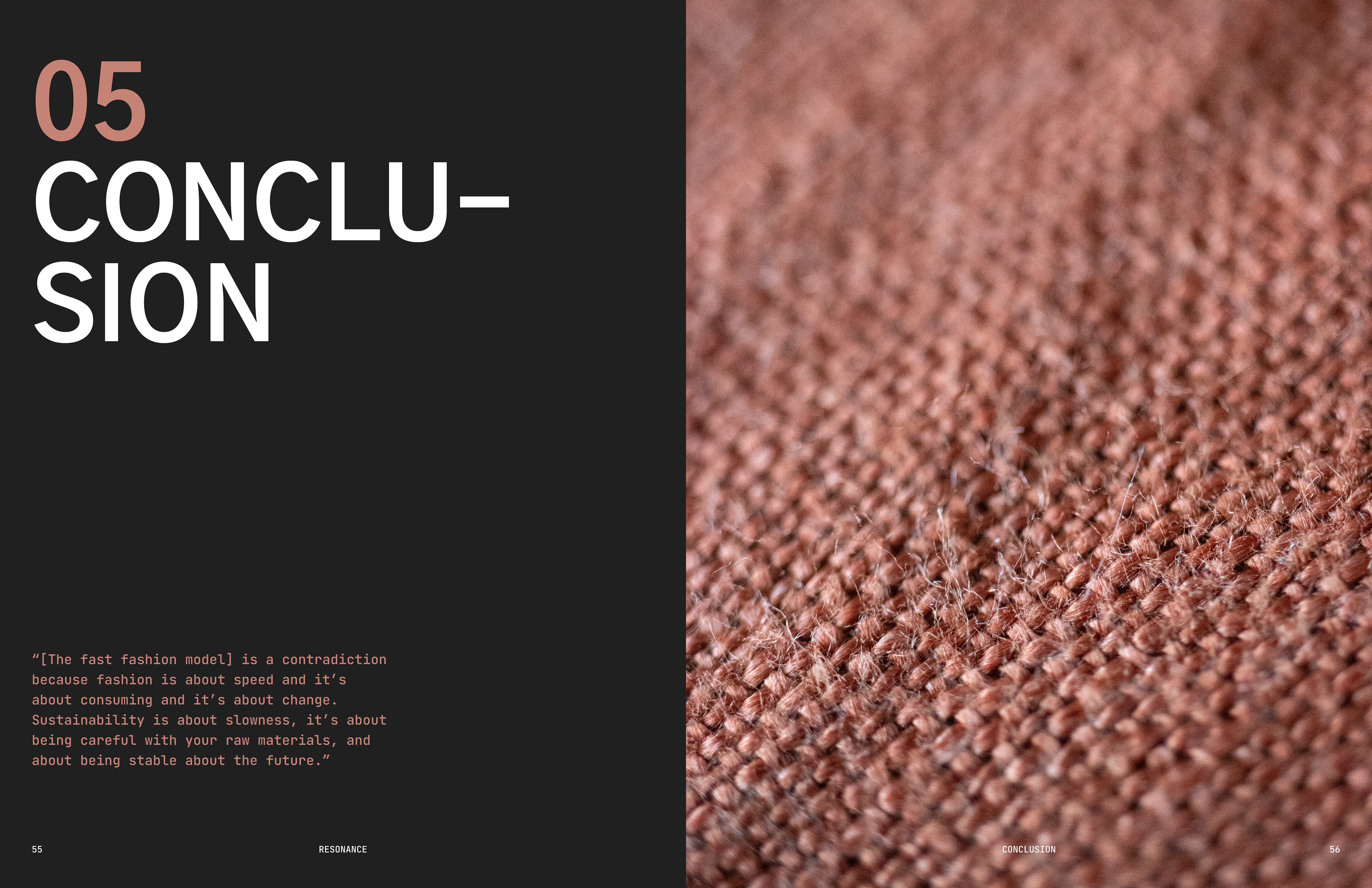
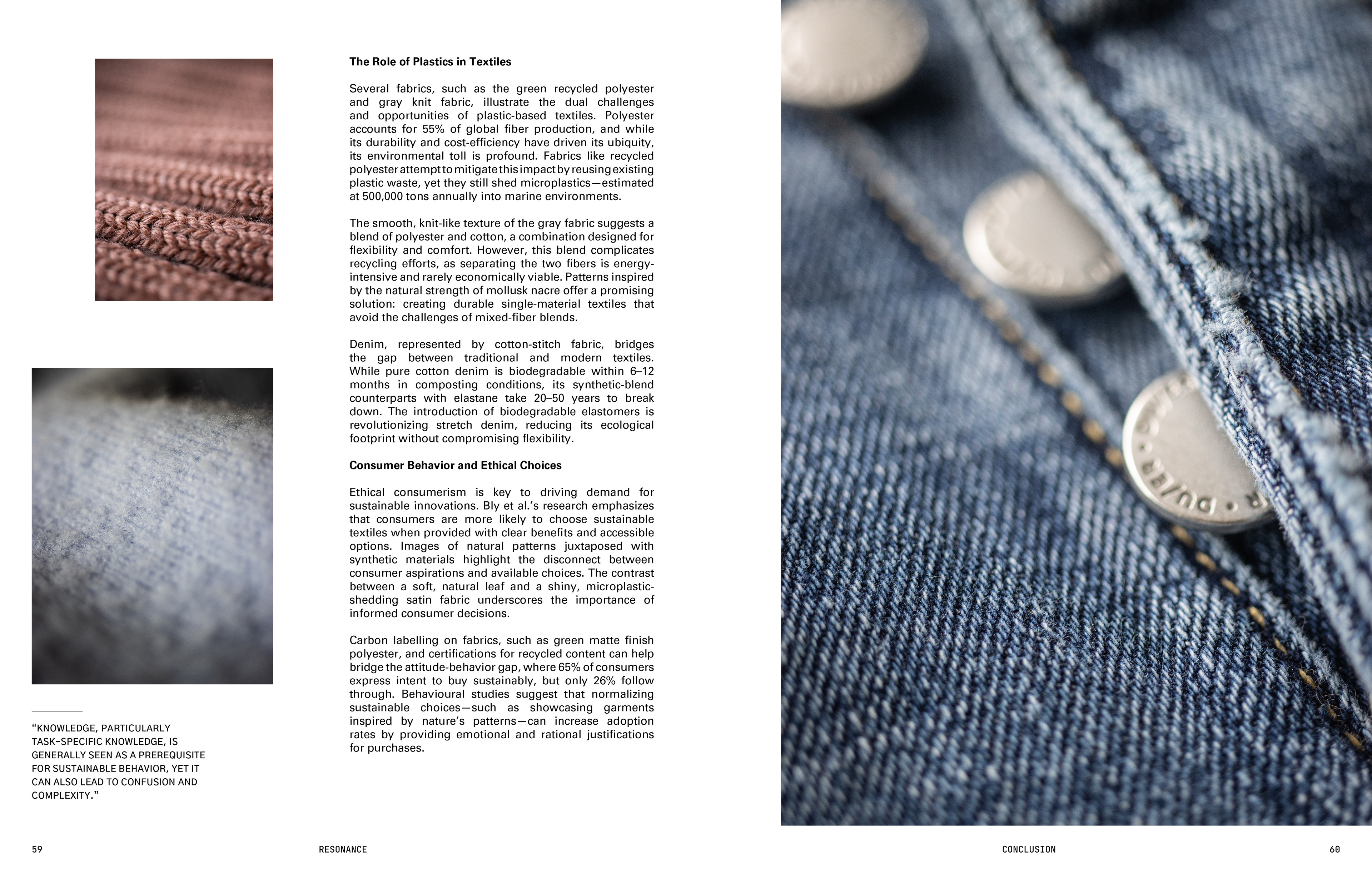
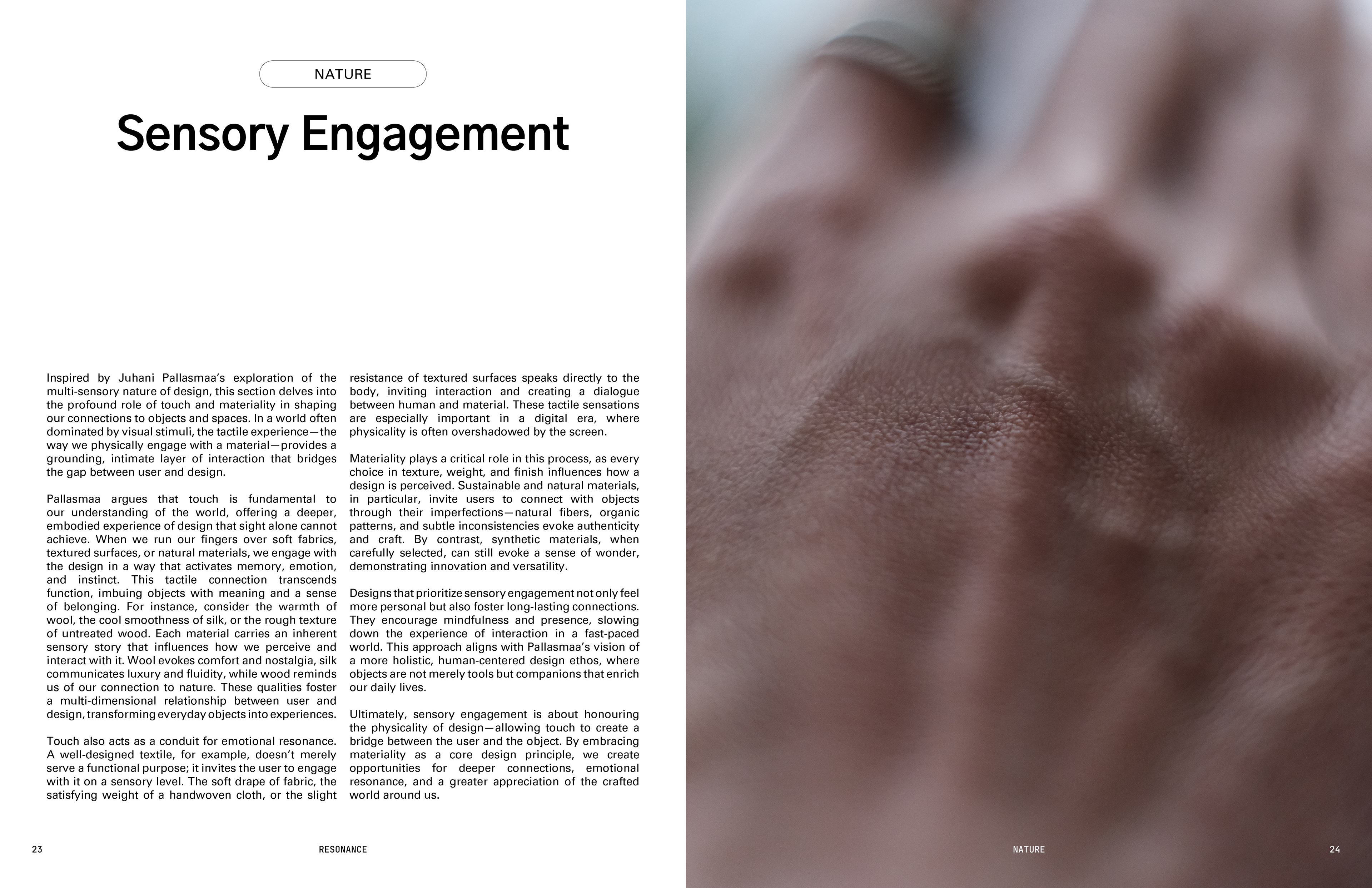
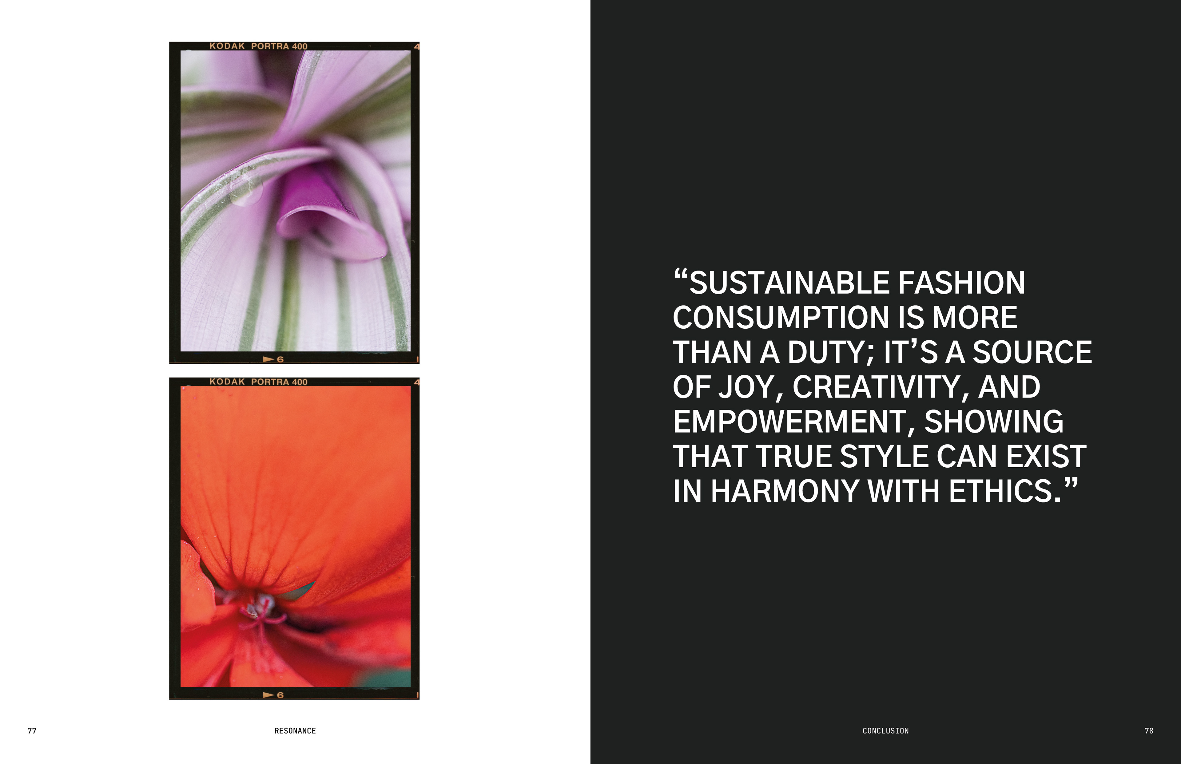
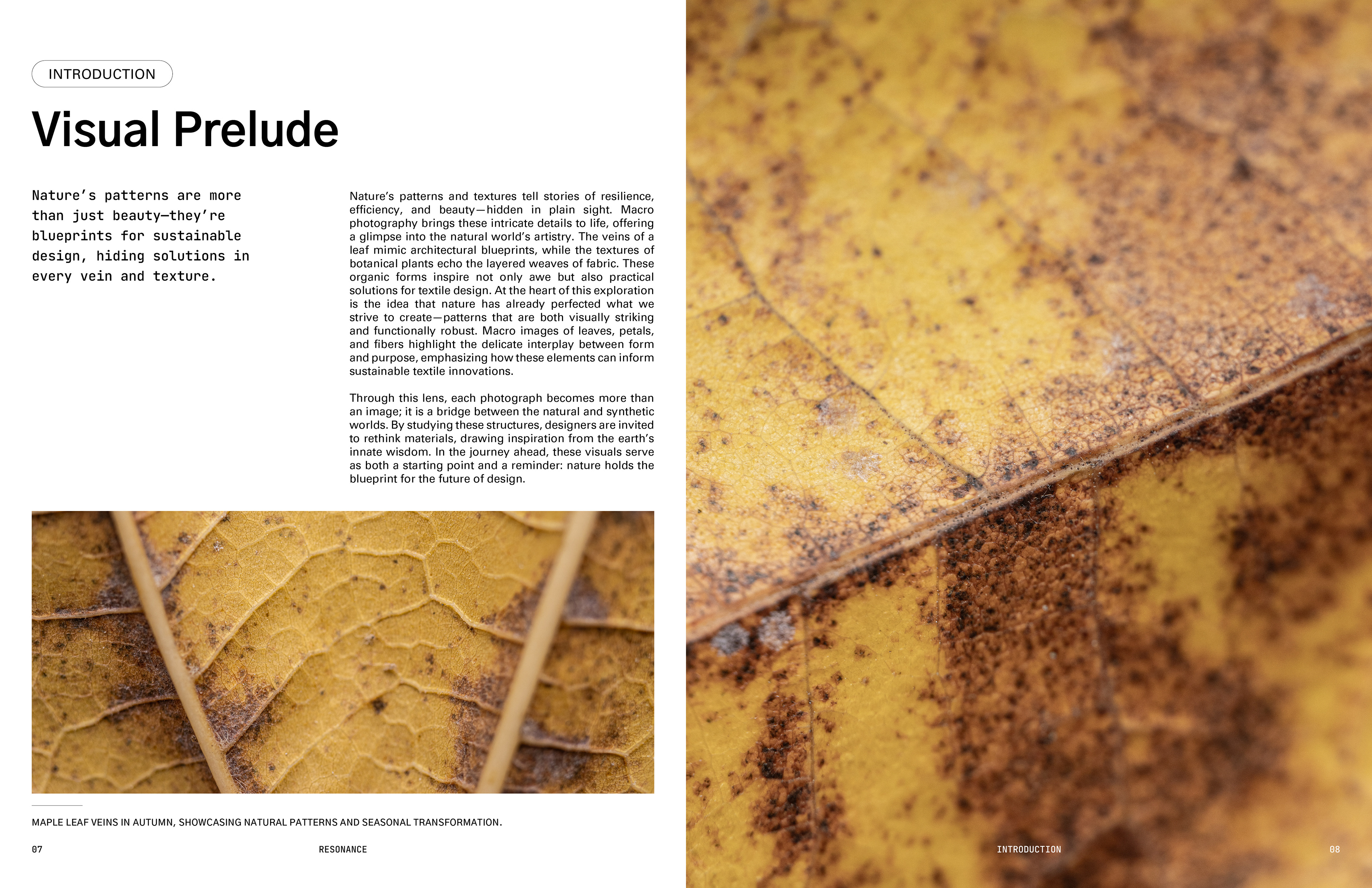
This project focused on sensory engagement. Macro photography revealed the fine details of natural and synthetic materials, elevating their aesthetic qualities. The editorial utilized a minimalist design with structured layouts, allowing the visuals to take center stage. Uncoated, tactile paper was chosen to enhance the physical interaction with the work. The natural imagery’s earthy tones contrasted sharply with the stark, artificial hues of the synthetic materials, creating a deliberate visual tension.

3. Technologies Used
Macro photography was a core element of this project. Using a Canon EFS 35mm f/2.8 Macro IS STM lens with controlled lighting, I captured detailed images of textures. Post-processing in Adobe Photoshop brought out subtle details and contrasts, while Adobe InDesign was used to create the editorial layout. This combination of analog observation and digital tools allowed for precision and depth in presenting the project’s themes.


4. Theoretic/Thematic:
Prompt 4 engaged with multiple theoretical frameworks:
Biomimicry (Benyus, 1997): The detailed photography of natural patterns emphasizes nature as a source of sustainable design inspiration.
Systems Thinking (Meadows, 1997): The project highlights the interconnectedness of natural and synthetic systems, showing how human consumption impacts the environment.
Earth Logic (Fletcher & Tham, 2019): The tactile, intentional design aligns with Earth Logic’s call to prioritize care and ecological balance.
The Thinking Hand (Pallasmaa, 2009): Tactile materials and sensory design reflect Pallasmaa’s emphasis on engaging both the hand and the eye in meaningful design.
A Pattern Language (Alexander, 1977): The editorial’s intuitive layout fosters a reflective and emotional connection, mirroring Alexander’s design principles.

5. Connections to Larger Systems:
The project connects to broader movements advocating for sustainable design and storytelling. It aligns with initiatives like Patagonia’s environmental campaigns and local Vancouver brands like Tentree and Ocin, which emphasize ecological responsibility and innovative storytelling. The editorial’s emphasis on materiality also reflects global efforts in the circular economy, showcasing how design can provoke thought and action around rethinking waste and resources.


6. Theme of My Choosing: What I Would Design Differently
If revisiting this project, I would create a participatory workshop where participants design patterns inspired by nature, guided by the prompt: What would your textile pattern look like if you were inspired by nature? Participants could use macro photography or observational drawing to explore materials and textures. This interactive element would deepen the project’s impact by fostering personal connections to the themes and expanding its narrative through collaborative contributions.