Welcome to Omega Nutrition’s case study presentation. During my two-year tenure, I led the company’s brand transformation, modernizing its visual identity while honoring its core values of health, wellness, and quality. This rebranding initiative, which included logo redesign, packaging updates, and cohesive marketing materials, shaped my skills as a designer and underscored the power of thoughtful, authentic design.
Full project: https://shararehhamed.design/Omega-Nutrition-Inc
Company: https://omeganutrition.com
1. The Process of Designing
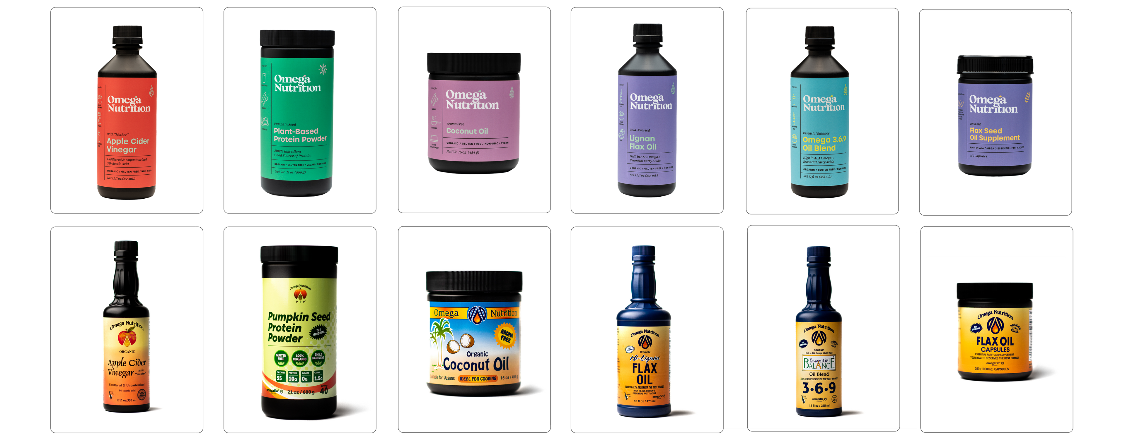
The Omega Nutrition Inc. rebranding project aimed to modernize the brand while preserving its core values of health, wellness, and quality. Through extensive research into industry trends and customer expectations, the challenge was to craft a contemporary yet legacy-rooted visual identity. By emphasizing minimalism and vibrancy, the final design reflected the health, vitality, and approachability central to Omega Nutrition's products.


2. Material/Aesthetic Concerns
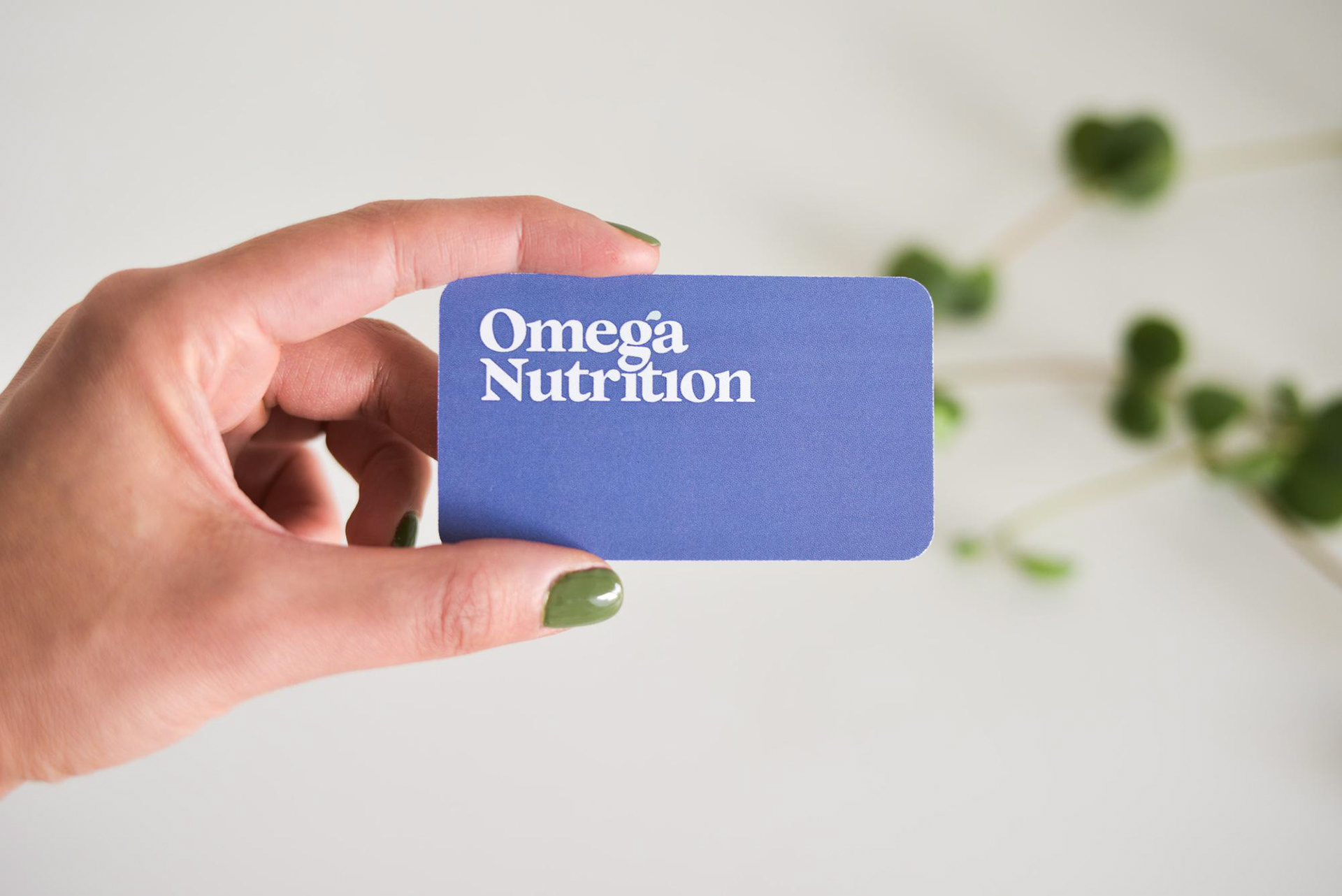
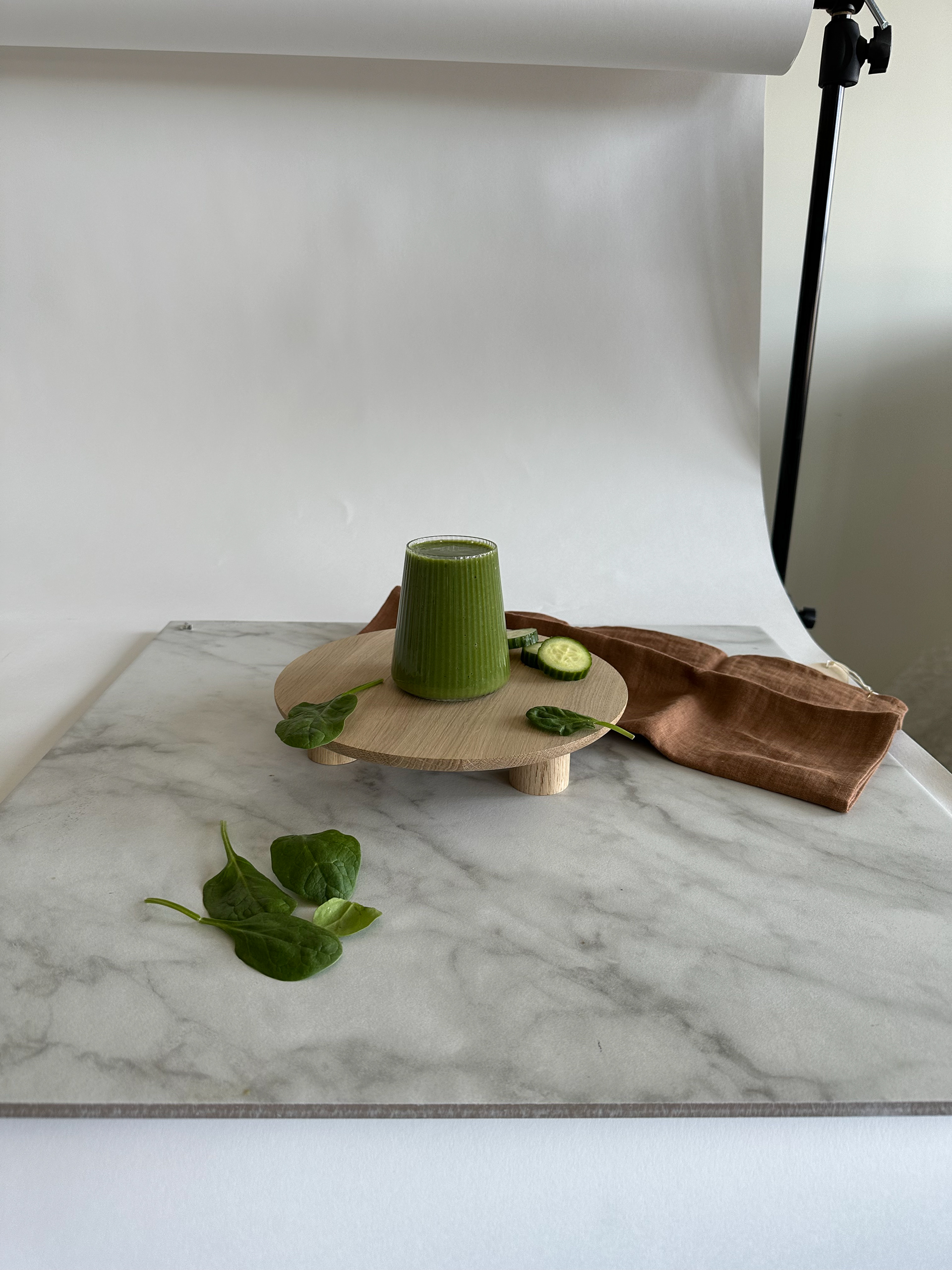
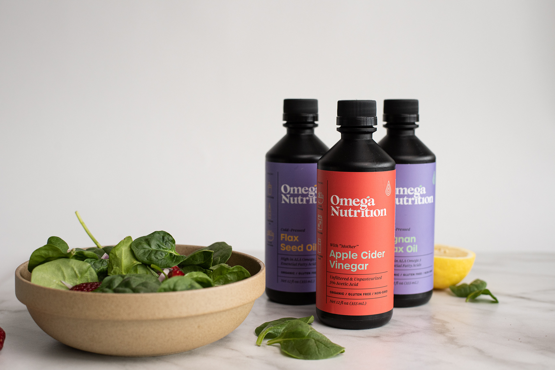
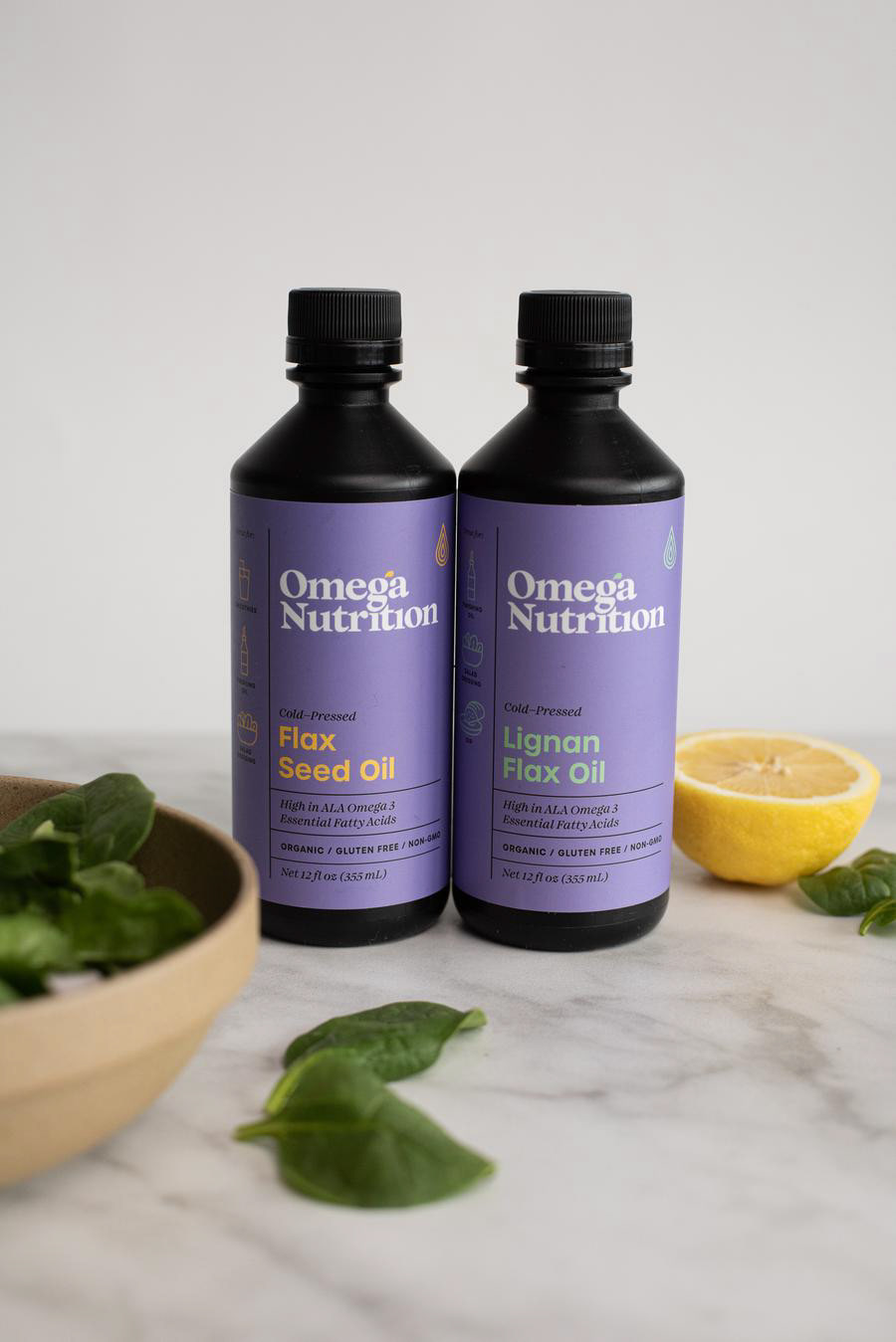
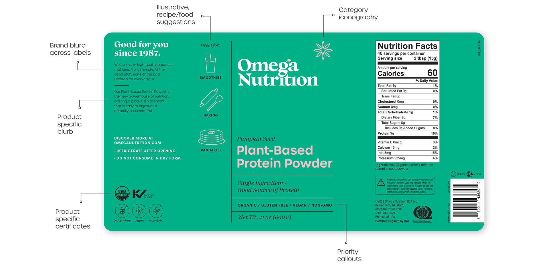
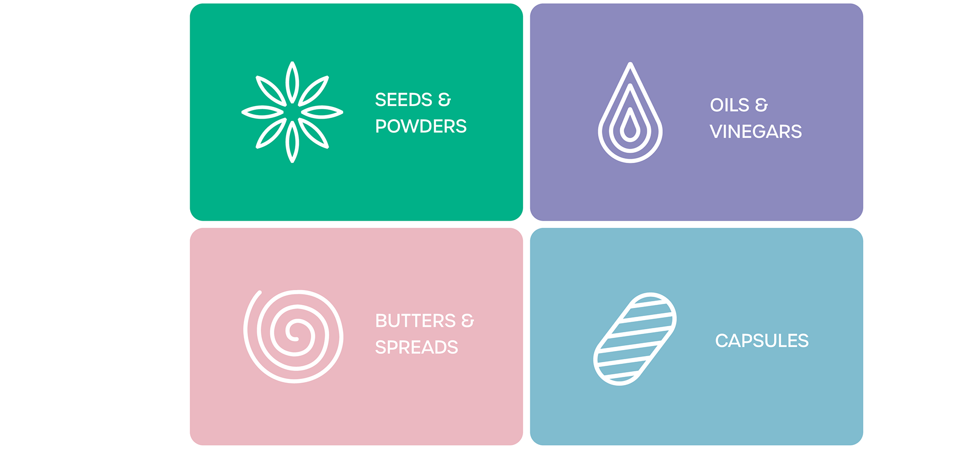
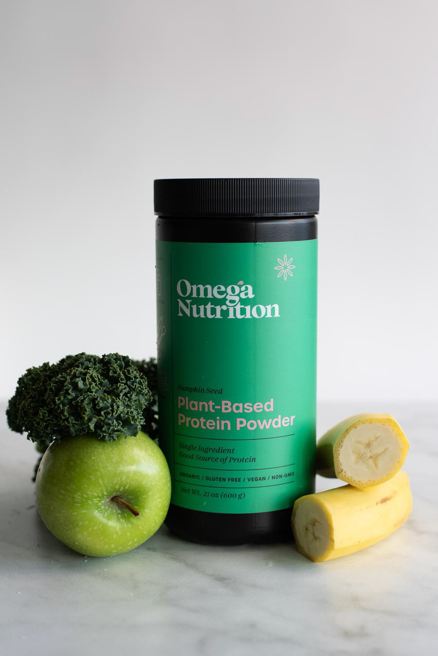
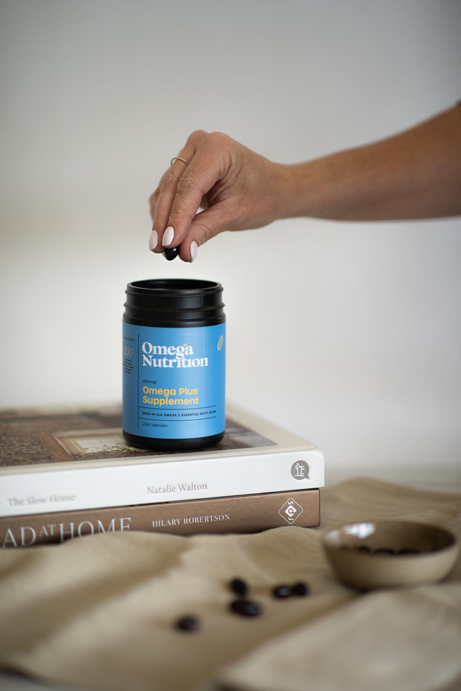
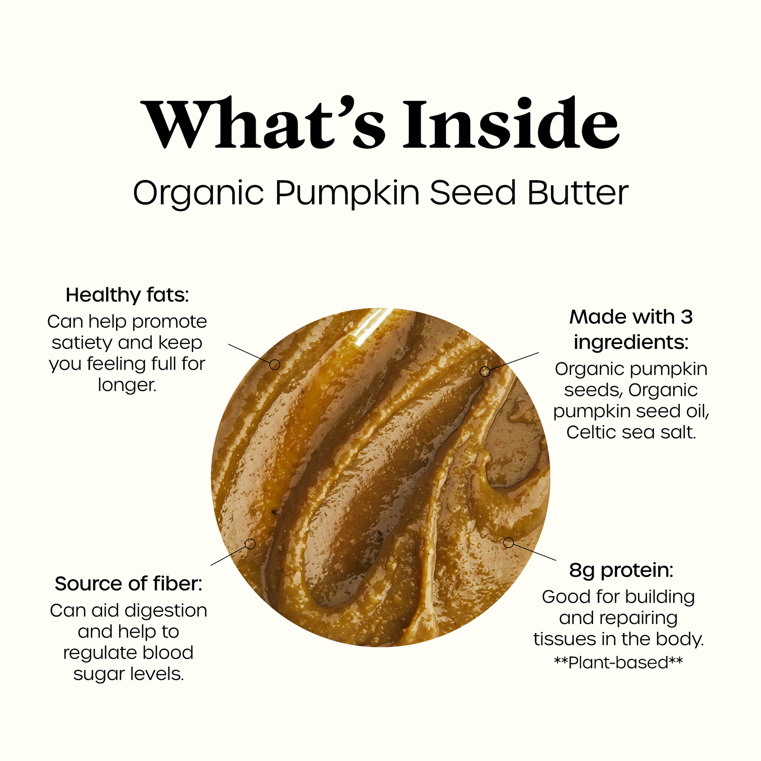
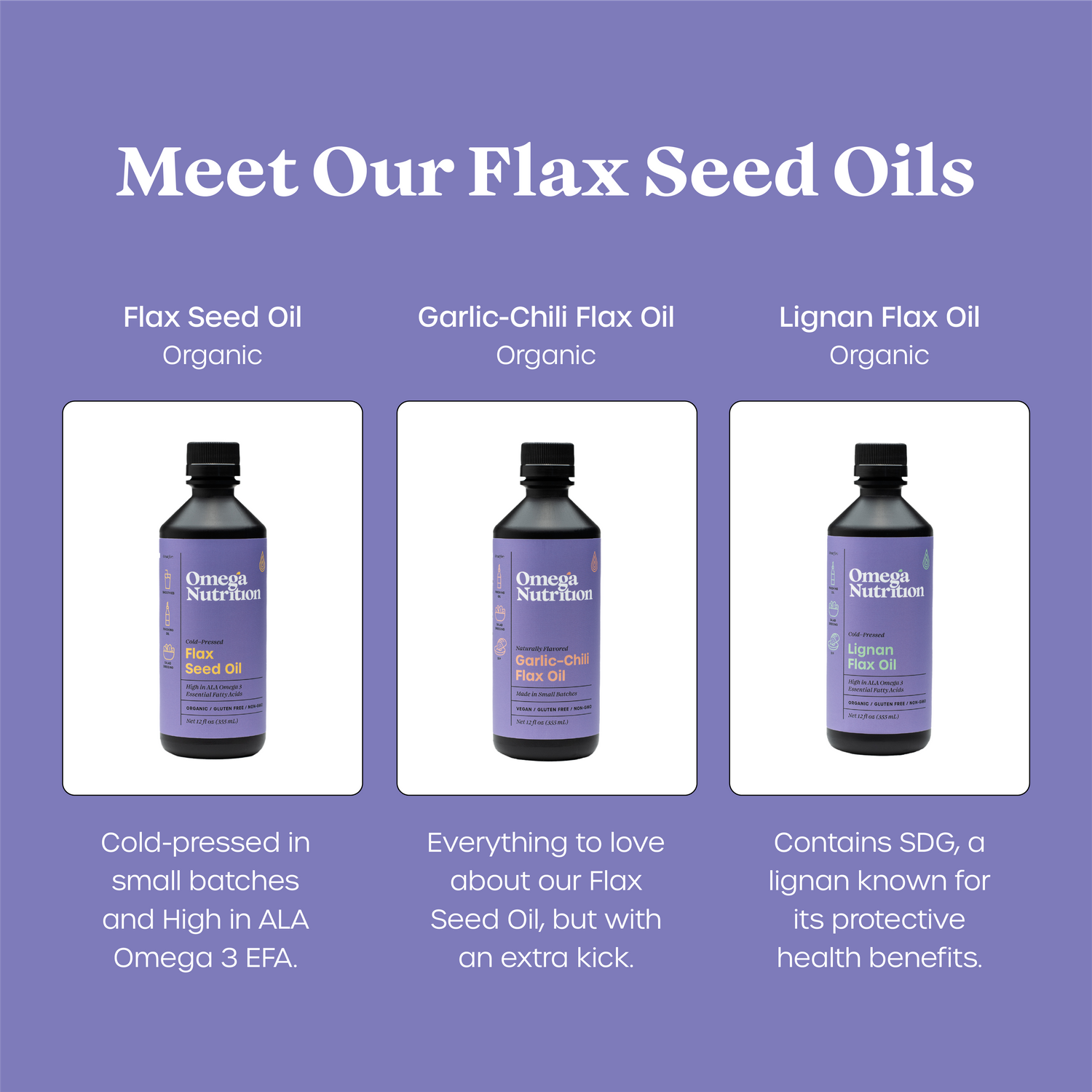
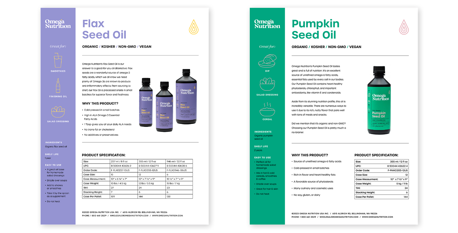
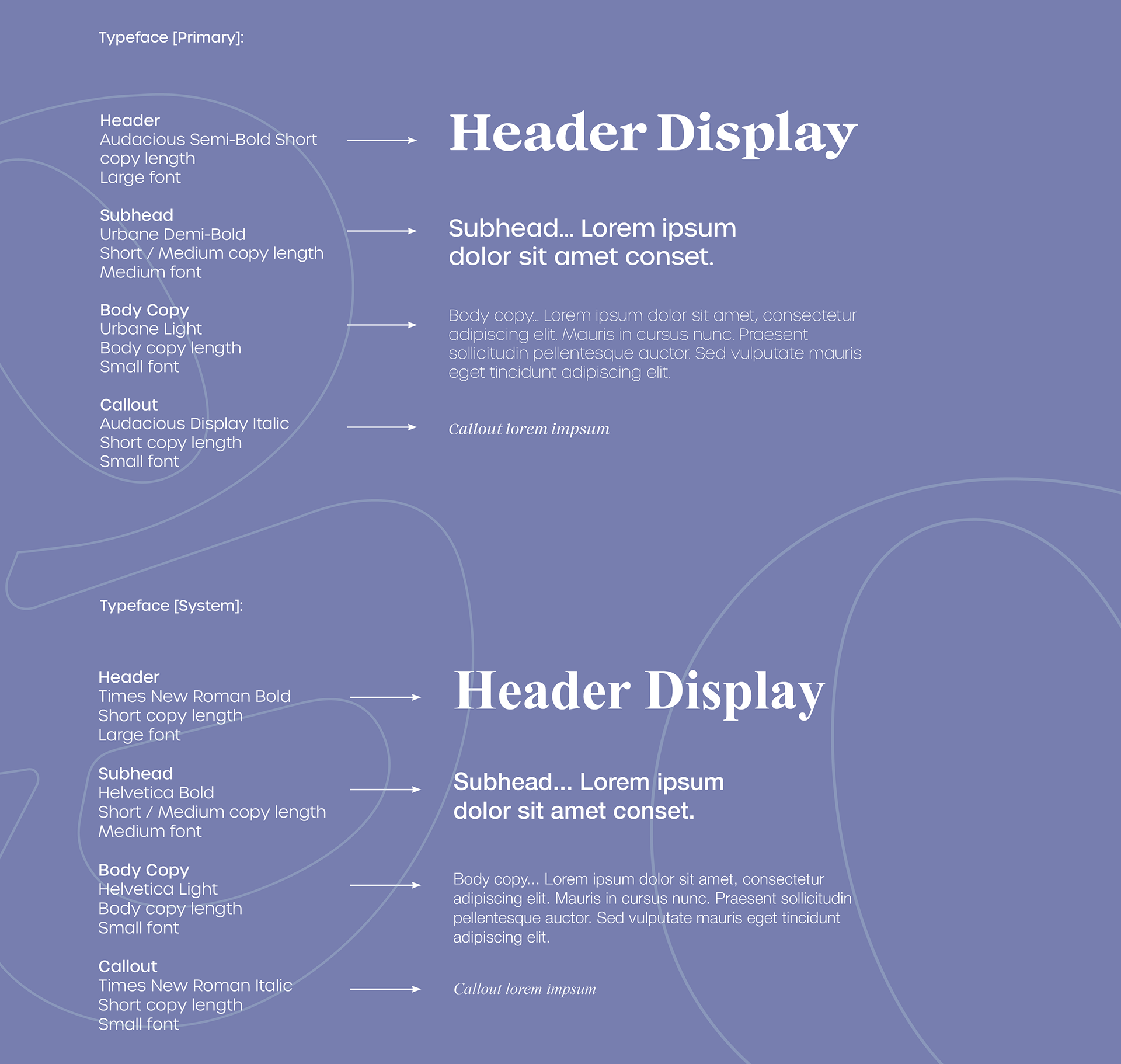
The rebranding introduced a vibrant color palette, grounded in color theory, to evoke vitality and energy with hues like greens and oranges symbolizing health and natural products. Clean, modern typography enhanced readability and conveyed trustworthiness, while consistent packaging layouts strengthened shelf presence and brand coherence. High-quality imagery showcasing natural, wholesome ingredients enriched the visual storytelling, reinforcing the brand’s commitment to quality and wellness.
3. Technologies Used
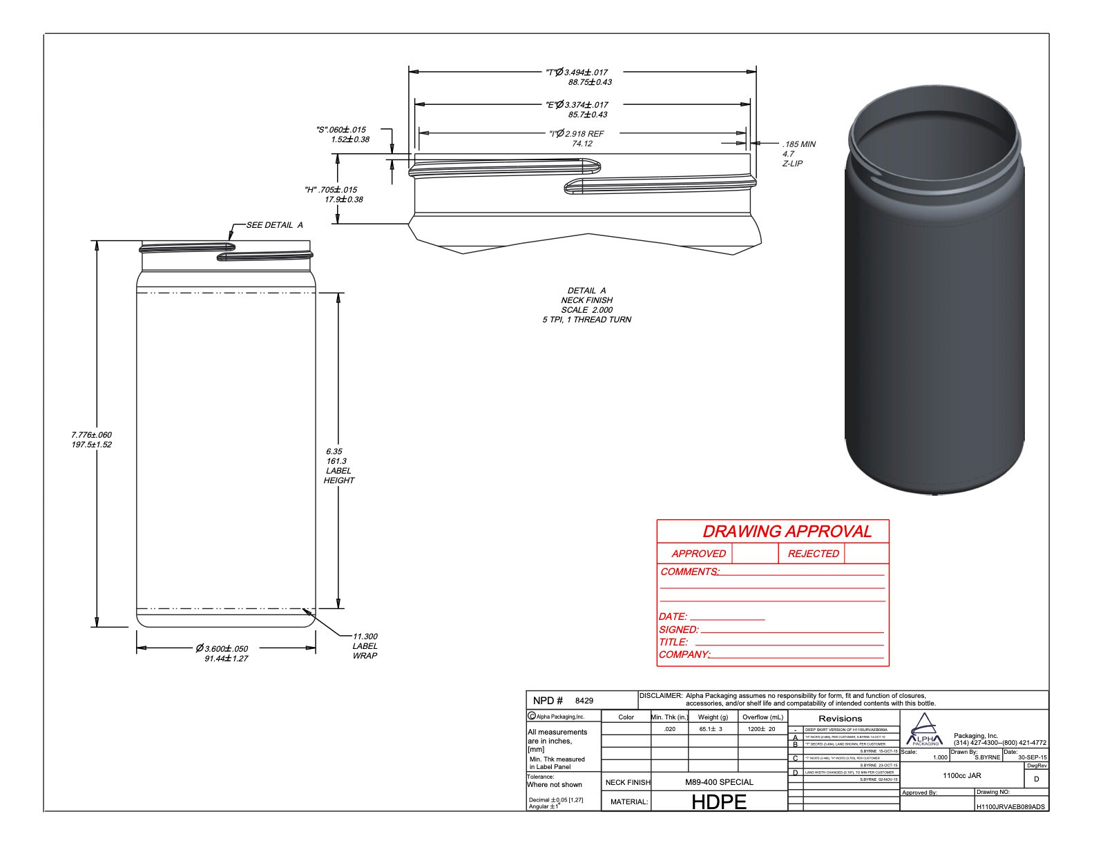
A range of digital and technical tools ensured precise execution and seamless communication throughout Omega Nutrition’s rebranding process. Adobe Illustrator and Photoshop were key for logo creation, packaging design, and marketing materials, ensuring consistency across all brand touchpoints. Web development tools facilitated a clean, intuitive website redesign, while digital prototyping enabled real-time testing and stakeholder feedback. High-quality e-commerce product photography was captured using a Nikon D810 and professional studio setup, with Adobe Photoshop employed for post-processing to maintain a sharp, polished aesthetic. Together, these tools modernized the brand's visual identity while preserving its authenticity and core values.
4. Theoretic/Thematic
This project reflects theoretical insights into branding, sustainability, and user trust:
Designing Against Dark Patterns (Sinders, 2021): Transparency in the brand’s messaging and design avoids manipulation, aligning with ethical design practices that build consumer trust.
A Pattern Language (Alexander, 1977): The use of clean layouts and intuitive design reinforces clarity and trustworthiness, creating a visual language that resonates with health-conscious audiences.
Earth Logic (Fletcher & Tham, 2019): Although not directly emphasizing sustainability, the rebranding aligns with Earth Logic’s principles of care by considering the holistic relationship between the brand, its audience, and the planet.
Brand Gap (Neumeier, 2005): The project applies Neumeier’s insights into creating cohesive brand narratives across all touchpoints, ensuring consistency in the messaging and visual identity.

5. Connections to Larger Systems
This project aligns with health and wellness industry trends by emphasizing transparency, minimalism, and vibrancy in branding. Drawing inspiration from brands like Whole Foods and Honest Company, Omega Nutrition’s rebranding incorporates clean layouts, approachable colors, and high-quality imagery to build trust and convey authenticity. With a focus on sustainability and eco-conscious practices, the rebranding modernized the company’s image, positioning it to meet consumer expectations with integrity and innovation in a competitive market.
6. Theme of My Choosing: What I Would Design Differently
If revisiting this project, I would explore sustainable materials for packaging, such as biodegradable or recyclable options, to align the design with eco-conscious consumer values. Additionally, incorporating interactive elements into the website, like a product selector or sustainability tracker, could deepen user engagement and highlight Omega Nutrition’s commitment to environmental responsibility.
This project reflects the transformative power of design in creating a strong, unified brand identity. By balancing modern aesthetics with the company’s legacy values, the rebranding successfully positioned Omega Nutrition Inc. as a contemporary leader in the health and wellness industry. Let me know if you’d like any adjustments or additional elaboration!